Screen Design and Generation
VERSION 1.0: SEPTEMBER, 1996
September 1996
Author: Steven Davelaar
Editor: Mark Pirie
Copyright © 1995 Oracle Corporation.
All rights reserved. Printed in the U.S.A.
This document is provided for informational purposes only and the information herein is subject to change without notice. Please report any errors herein to Oracle Corporation. Oracle Corporation does not provide any warrants covering and specifically disclaims any liability in connection with this document.
Introduction
This paper provides guidelines for designing screens which can be fully generated using the Designer/2000 Oracle Forms Generator.
The guidelines supplied in this paper are primarily based on two style guides:
- MS Windows Style Guide (for version 3.1 as well as Windows `95)
- Oracle Applications User Interface Standards, as far as they currently are generated using Designer/2000.
Mostly, these two style guides are complementary. Whereas the MS Windows Style Guide only provides general standards and guidelines, the Oracle Applications style guide provides detailed standards and guidelines specific to the use of Oracle Forms.
The following main aspects of screen design are covered:
- screen and window size
- font
- single-record format
- using item groups
- multi-record format,
- scrolling region (spread table)
- overflow region
All sections are split in two; the first part discusses rules, guidelines, and considerations that apply to the specific topic, while the second part explains how items are generated using Designer/2000.
All preferences settings discussed in this paper which have a recommended value which deviates from the default factory setting are marked with an asterix in parentheses[ (*)].
| Attention: The preference settings assume a REAL coordinate system with INCH as unit, a character height of 0.1 and a character width of 0.1. The resulting effect of a number of preferences is determined by this coordinate system setting in your template form. (preference value * character width/height) |
Screen and Window Size
The first question to answer is very deterministic for your user interface design: How large will my screens be? And related, which screen resolution(s) do I use? If multiple screen resolutions are to be supported, an extra burden is placed on the already complex task of user interface design.
Reserving space for the menu-bar, button toolbar, and status lines, the amount of space left differs considerably, depending on the screen resolution:
- VGA: width 6.4 inch, height 3.5 inch (approximately)
- SVGA (800x600): width 8 inch, height 4.7 inch (approximately)
Deciding on the screen resolution is just half of the issue. Knowing which screen resolution to use means you know the maximum size of your screens, not the optimal size. In a character mode environment, all screens are the same size. However, in a GUI environment the principle of `just-to-fit' windows is more appropriate. The window should show the complete `picture', no more and no less. Efficient use of space allows the user to open and tile several (smaller) windows, switching between them by a simple mouse-click. In other words, the combined size and resolution of the display should allow users to view meaningful amounts of information in multiple windows without requiring numerous moving, resizing, or scrolling operations.
Generation
The mechanism which the Forms Generator provides for generating the desired screen size and just-to-fit windows has two preference settings. These enable vertically expanding pages (canvasses) and windows:
PAGEXP Pages may expand vertically as required Y
WINSCR Window is scrollable N
You still need to specify the boundaries for the growth, determined by your screen resolution, as well as the minimum size with which to start:
WINFWD Window frame width 40, 64 or 80(SVGA 800x600 only)
WINFHT Window frame height 20 (arbitrary, expands as needed)
PAGCWD Page canvas width 40, 64 or 80 (SVGA 800x600 only)
PAGCHT Page canvas height 20 (arbitrary, expands as needed)
CANMHT Canvas maximum height 35 (VGA), 47 (SVGA 800x600)
Because the generator only supports vertical expansion of windows and canvasses, the specified window and canvas width is the minimum, as well as the maximum, screen width. This forces you to figure out in advance the desired display width of a particular screen you want to generate. A pragmatic approach to this problem is defining two or three standard canvas and window widths; for example small, medium, and large. By specifying a width of 40 (4 inch) for small screens, you enable the user to vertically tile two of these screens with the contents still completely visible (at a screen resolution of at least 800x600 pixels).
Note that after first generation of the form, the above preference settings will be overruled by the corresponding detailed table usage properties `page height', `page width', `view height' (equals WINFHT), `view width' (equals WINFWD) and `Window scrollable', provided that the generate option `Update repository' is checked.
Window Positioning
Always position the first window of a form at the upper-left corner. All subsequent windows should open staggered, relative to the first window, so that a part of each preceding window will remain visible.
The Forms Generator uses the View Position X and View Position Y properties of the Detailed Module Table Usage to determine the initial window position. Set these properties to 0 for the first window in the form, and increase this value by 3 (equal to 0.3”) for every subsequent window, to achieve the staggered look. There are no generator preferences which are equivalent to these properties.
Font
The style guide of Windows 3.1 only prescribes MS Sans Serif as the standard font; standards and guidelines for font size and weight (except the bold font weight for button labels) are not explicitly supplied. When looking at the layout of native MS Windows, for example, the Print Dialog Window, the 8-point font size and bold font weight are predominantly used. The Windows `95 styleguide has more detailed standards. The most striking difference with Windows 3.1 is the font weight. Windows `95 predominantly uses the medium font weight. Oracle Applications uses the 10-point font size. The font weight used is a mix of Windows 3.1 and Windows 95. For prompts the medium font weight is used, for titles and data the bold font weight is used.
You can generate your preferred font by defining the appropriate CG$ visual attributes in the template form. The following table lists the recommended minimum set of visual attributes to include in your template form:
| Object | Visual Attribute |
| Prompts | CG$PROMPT |
| Window titles | CG$WINDOW |
| Menu entries | N/A |
| Group Titles | CG$TITLE |
| Canvasses | CG$CANVAS |
| Check boxes | CG$MANDATORY_CHECK_BOX
CG$OPTIONAL_CHECK_BOX CG$DISPLAY_CHECK_BOX |
| Radio groups | CG$MANDATORY_RADIO_BUTTON
CG$OPTIONAL_RADIO_BUTTON CG$DISPLAY_RADIO_BUTTON |
| Textual buttons | CG$PUSH_BUTTON |
| Iconic Buttons | CG$PUSH_BUTTONS |
| List items | CG$ITEM
CG$DISPLAY_TEXT_LIST CG$DISPLAY_POP_LIST |
| Text items | CG$ITEM |
| Disabled text items | CG$DISPLAY_ITEM |
Screen Layout
The fundamental problems to solve when designing a screen are how to best present information to a user, and how to allow the user to access the information. Design each screen by carefully analyzing and applying the available presentation models, taking into account the user's perception of information.
Placing information in a window always involves a compromise between the desire to see many records of an entity simultaneously, and to see all of the detail about each record at once. A summary view has the advantage of showing more records of an entity, but at the loss of detailed information about each record. The next sections discuss different presentation models which can be generated.
Single-Record Formats
Single-record formats allow the maximum number of fields for a single-record to be displayed at once. In general, single-record formats should be used for any of the following cases:
- there is only one record possible
- the user commonly works with only one record
- the user must see many attributes of one record at the same time
Recommended layout rules for single-record blocks:
- If the items take up more than one line, the items on adjacent lines should be left-aligned, where possible.
- Adjacent lines do not have a one-line gap.
- Prompts should be placed to the left of the field.
- Prompts are positioned to the left of an item, with one character cell between the rightmost character of the prompt and the start of the item.
- Prompts should normally be drawn on a single line. In the case of a multi-line field, the prompt may occupy multiple lines but should not extend below the bottom of the field. Prompts may also be in multi-line format for T-lists.
- If the screen will be used to record information specified on a paper form, `mirror' the paper form layout to your screen design.
Generation
A single-record format is generated by specifying `1' against the `Rows displayed' property of the Detailed Module Table Usage. The desired layout is generated by setting the following generator preferences:
LAYOUT - PAGE
PAGFTS Page footer separator 0
PAGHDS Page header separator 0
PAGMAR Page margin N
PAGFTB Title first block on page N (*)
LAYOUT - BLOCK
BLKDEC Decoration None (*)
BLKFTS Footer separator 1
BLKHDS Header separator 1
BLKJUS Justification Left (*)
BLKLYS Layout style Fill
BLKMAR Margin 1
BLKMLL Block multi-line line separator 1
(assumes use of item groups, else set to 0 (*))
BLKTFB Title first block N (*)
BLKUTT Use block tabulation table None (assumes use of item groups)
BLKVFL Vertical fill Y
BLKVSB Vertical scrollbar N
LAYOUT - ITEM
ITMASP Allow split prompts Y
ITMBIF Base item sizes on the font Y
ITMDPS Default prompt separator null (*)
ITMIPG (Previous) item prompt gap 2
ITMPAS Allow prompts above in a
single-row block N
ITMPIG Prompt/item gap 1
ITMSPM Split prompt marker | (or any other character) (*)
As soon as the items occupy more than one line, vertical alignment of the items becomes an issue. The recommended approach to vertically aligning items is to use item groups (see next section). The alternative, using the block tabulation table (BLKUTT = SD) raises the problem of setting appropriate values for the block tabs (BLKTAB). The optimal value for BLKTAB depends on a number of factors (prompt length, item length, item sequence, block space), which differ for each block in each module. To avoid having to figure out the optimal settings for BLKTAB each time, use item groups. If you do not want the user to be aware of the item groups, omit item group decoration and set all margin preferences to zero.
Only for blocks with very few items (less than 5 to 6) is the use of block tabulation favored over item groups. With just a few items, the tab setting is easy and the generated layout is predictable.
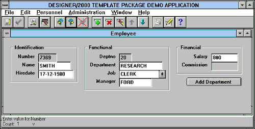
Figure 1 Single-Record Format with Item Groups
If you use a GUI item (checkbox, poplist, radio group, etc.) to display the item, increase the display width of the corresponding Detailed Column Usage, to fully show the widget and associated data. For example, the prompt of a checkbox is not rendered as boilerplate text like a text item. Instead, the checkbox has a `Label' property which is shown to the right of the checkbox indicator. In order to display this label, make sure the `Display width' property of the checkbox is large enough to show the indicator, as well as the label. If you want the generator to compute the required display width of GUI items, set generator preference ITMODD (Override Item Display Dimensions) to `GUI'.
Using Item Groups
Presenting an entity with a large number of attributes merely as a 'sea' of fields forces the user to scan an entire screen to locate the piece of information they are seeking. To enable the user to quickly find the information needed, you should carefully organize and group the data to allow a user to navigate the information more easily and naturally. A natural way of grouping data can be applied by `mirroring' the grouping of a paper form used by the end user during data entry tasks.
`White space' is the preferred method to visually separate groups of data elements. If space is limited, item groups are usually drawn with boxes around them. An item group has a title if it aids the user; it may be untitled if the information in it is 'obvious'.
Generation
Item groups in Designer/2000 are created as a separate object within a module. Optionally, you can specify a title for the item group. The Layout Style property of an item group is currently not applicable to the Forms Generator. The preference GRPENB (Item group enable) determines the appearance of lookup Detailed Module Column Usages in an item group. If this preference is set to `Base', all lookup Detailed Module Column Usages are automatically included in the item group, as long as the corresponding foreign key column-usage is in the item group. If this preference is set to `Global', you need to set the Item Group property of a lookup usage to include it in any item group. Note that with GRPENB set to `Base' and the foreign key column itself non-displayed, you should include the first displayed lookup usage in the item group, or else the item group title won't show up.
| Attention: Make sure that all detailed module-column-usages you want to show up in the same item group are sequenced adjacently. If not sequenced adjacently, each break causes a new item group box (with the same title) to be displayed on the screen. |
Recommended generator preference settings for generating item groups on MS Windows platform:
BLKBWD Brush width 2
GRPBWD Brush width 2 (*)
GRPDEC Decoration None / Inset rectangle (*)
GRPDST Dash style Solid
GRPFTS Footer separator 1
GRPHDS Header separator 1
GRPHIS Horizontal inter-item spacing 2
GRPMAR Margin 1
GRPOWG Orientation within group Vert
GRPTLJ Title justification Left
GRPTLM Title margin 1 (*)
GRPTLP Title position On decoration (*)
GRPTLS Title spacing 1 (*)
GRPUTT Tabulation table SD (align start of items) (*)
GRPVIS Vertical inter-item spacing 0
If you do not use group decoration, consider increasing the margin (GRPMAR) to `2' for a visually more pronounced `white space' distinction.
From a user interface style guide perspective, there is no preferred orientation of item groups. In general, with a vertical orientation of item groups (GRPOWG=VERT), it is easier to get a visually pleasing layout. As soon as a horizontal item group takes up more than one line, the GRPTAB (Group Tabulation) preference must be used to vertically align items that are placed on different lines. As the appropriate values of GRPTAB are largely dependent on the (maximum) prompt length of the items involved, it can be very difficult to find the optimal tab settings.
However, the GRPTAB preference allows you to establish a descriptor item (lookup usage, optionally without a prompt) to be placed directly to the right of the foreign key item, while the other items in the item group are vertically oriented, as the following picture shows.
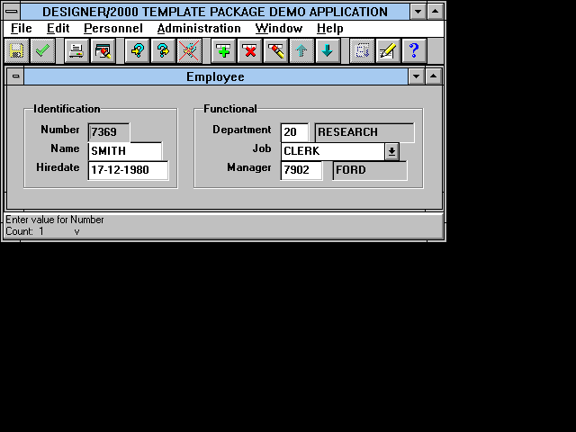
Figure 2 GRPTAB Used to Position Descriptor Items Properly
The form in the above picture is generated with the following generator preferences set at the level of Item Group `Functional':
GRPHIS Horizontal inter-item spacing 0 (*)
GRPOWG Orientation within group Hori (*)
GRPTAB Group tabulation 9.13.15
Multi-Record Formats
Multi-record formats allow numerous records for a single entity to be displayed at once. In general, multi-record formats should be used for any of the following cases:
- The user must see multiple records to perform the transaction, because there is a relationship between the records.
- The user must see summary attributes of many rows at the same time, typically to scan for information quickly.
- Displaying data in a multi-record format conveys that more than one record can be entered.
- The user normally perceives of the entity in a multi-record format (e.g., `Order lines').
Recommended layout rules for multi-record blocks:
- A record contains only one line, if space is sparse an overflow region (preferred) or a spread table can be used (see below).
- The items are generally stacked horizontally. Space may be left between items where prompt size or region cosmetics require so.
- Prompts are positioned above the first record of each item.
- Prompts for text items are left-, center-, or right-aligned similar to the data in their corresponding text field.
- Prompts for pop-lists are always left-aligned.
- Prompts for checkboxes are always centered above the box.
- Prompts may be split over several lines to prevent the prompt length from being much greater than the item length. Each line should have approximately the same number of characters per line.
- For descriptor fields, prompts may be left out.
A multi-record block should have a vertical scrollbar and a current record indicator. For screens that show enough rows to accommodate the maximum number of records, the scrollbar may be left out.
The MS Windows style guide prescribes that the scrollbar be positioned to the right of the data. However, when scrolling through the records the user usually looks at the primary key information to identify the row. As this information is mostly presented in the first, left placed, item(s), we recommend positioning the scrollbar to the left, being compliant with Oracle Applications.
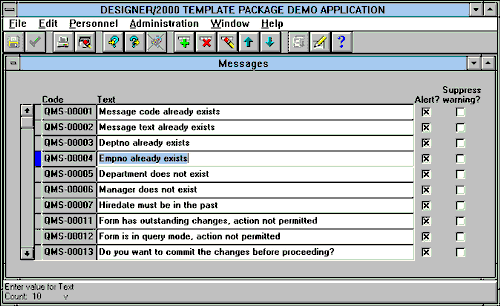
Figure 3 Multi-Record format with current record indicator
Generation
A multi-record format is generated by specifying a number higher than `1' against the `Rows displayed' property of the Detailed Module Table Usage. If you want the generator to compute the maximum number of rows that can be displayed, leave the `Rows displayed' property empty. The generator will then show the maximum number of rows that can be displayed with the current canvas height (determined by PAGCHT) and, between brackets, the maximum number of rows that can be displayed if the page is expanded to the maximum (determined by CANMHT).
The desired layout is generated by setting the following generator preferences:
LAYOUT - BLOCK
BLKDEC Decoration None (*)
BLKFTS Footer separator 1
BLKHDS Header separator 1
BLKJUS Justification Left (*)
BLKLYS Layout style Fill
BLKMAR Margin 1
BLKSBP Scrollbar position Left
BLKSBS Scroll bar separator 0 (*)
BLSBW Scrollbar width 2
BLKSLR Single-line row separator 0
BLKTFB Title first block N (*)
BLKVSB Vertical scrollbar Y (*)
LAYOUT - ITEM
ITMASP Allow split prompts Y
ITMBIF Base item sizes on the font Y
ITMIPG (Previous) item prompt gap 0 (*)
ITMPJL Prompt justification above a
left justified field Left
ITMPJR Prompt justification above a
right justified field Right
ITMPLM Allow prompts left of items
in multi-record block N
ITMSPM Split prompt marker | (or any other character) (*)
A checkbox in a multi-record block should have its prompt centered above, just like the other items. To prevent the prompt from appearing to the right of the checkbox, set the Display width property to `1' in the Detailed Module Column Usage and the following preferences:
CBXALM Allow label above check
indicator in multi-row block Y
CBXIWD Checkbox indicator width 1 (*)
A current record indicator can be generated by creating a secondary, non-base table item and setting the display datatype of this item to `Current Record Indicator'.
Scrolling Region (Spread Table
)
A record in a multi-record block should appear on only one line. If the record has more items than can be displayed on one line, a scrolling region or spread table can be used to make the additional fields visible. Scrolling to additional fields is not desirable, because it involves complex hand-eye coordination, and can be very frustrating if commonly-used fields are always out of sight. Therefore, a spread table should only be employed if a few fields will not fit within the space of the region, and they are used less frequently than the visible fields. If this condition does not hold, consider the use of a single-record format or an overflow region (see next section).
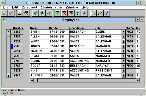
Figure 4 Spread Table Format
Generation
Designer/2000 settings for generating a spread table in a multi-record block:
- Set Overflow property to `Spread Table' in detailed-module-table usage.
- Set Context? property to `True' for all displayed Detailed Module Column Usages you do NOT want to appear in the scrolling region of the spread table.
Recommended generator preference settings for spread table:
OFADFT Use default context items N (*)
OFAMAR Overflow area margin 1
SPRBEV Spread table bevel NONE (*)
SPRHSB Horizontal scrollbar Y
SPRSBH Scrollbar height 2 (*)
Overflow Region in Multi-Record Block
When information is presented in a multi-record format, but additional detail about the current record is displayed in a single-record format in the same window, the additional detail is referred to as an "overflow region".
It is best to use an overflow area when:
- the user must see data in a multi-record format, but also needs to see a small amount of additional detail about the current record
- records include multi-line text items and the multi-line items may be rendered in the overflow region
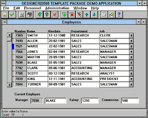
Figure 5 Multi-record Format with Overflow Below
Generation
Designer/2000 settings for generating an `overflow area' in a multi-record block:
- Set Overflow property to `Overflow area below' or `Overflow area right' in Detailed Module Table Usage.
- Set Context? property to `True' for all displayed Detailed Module Column Usages you do NOT want to appear in the overflow region.
Create an item group for the items that must appear in the overflow region. This allows you to keep space between the items in the overflow area, using the GRPHIS preference. If you do not use an item group, preference ITMIPG (Item Prompt Gap) controls the space, leading to no inter item spacing at all, as this preference is set to zero for the multi-record region. Another advantage of this approach is that you can set the overflow title using the item group prompt, saving you the work of setting the OFATTL every time at Module Table Usage level.
Recommended generator preference settings for overflow region:
LAYOUT - OVERFLOW
OFABCS Content separator 1
OFADEC Decoration None (*)
OFADFT Use default context items N (*)
OFAFTS Footer separator 1
OFAHDS Header separator 0 (*)
OFAJUS Justification Left (*)
OFAMAR Margin 0 (*)
OFAMLL Multi-line line separator 0 (*)
LAYOUT - ITEM GROUP
GRPDEC Decoration None (*)
GRPFTS Footer separator 0 (*)
GRPHDS Header separator 1
GRPHIS Horizontal inter-item spacing 2
GRPMAR Margin 0 (*)
GRPOWG Orientation Hori (*)
GRPTLJ Title justification Left
GRPTLM Title margin 0 (*)
GRPTLP Title position Inside
GRPTLS Title spacing 0 (*)
GRPUTT Tabulation table Null
Displaying Multiple Blocks in Same Window
If workspace allows, you can display more than one block in one window. Typical situations justifying a master-detail relationship shown in the same window are :
- The user perceives the information shown in the master and detail block as one `logical entity'. For example, the user perceives an `Order' as the combination of general order data, customer data, order lines, and ordered goods data.
- The master and/or detail block contain very few items, making it `overdone' to separate the data into two windows.
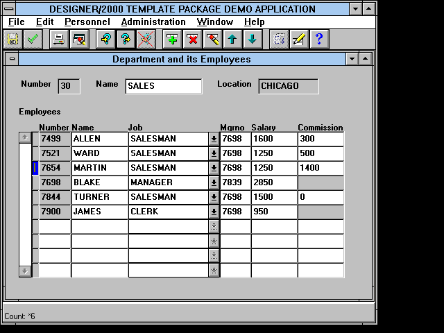
Figure 6 Master-Detail Blocks in Same Window
Generation
Setting the Placement property of the Detailed Module Table Usage to `Same Page', causes the Oracle Forms generator to position the detail block below the master block in the same window.
The generator preferences BLKDEC (Block decoration) and PAGIBS (Page inter-block separator) can be used for the detail-block to create a visually more pronounced distinction between both blocks; for example BLKDEC = `Inset rectangle' and PAGIBS = 1. Only set the Display title property in the Detailed Module Table Usage of the detail-block if the content of the block is not obvious.
Reference
This paper only covers screen design. For information on other aspects of user interface design (screen behavior, menu design, message handling, on-line help) the Oracle Method Standards and Guidelines volume Systems Design and Generation using Designer/2000 is recommended.
All user interface standards and guidelines as described in this volume are implemented in a sophisticated template package for the Oracle Forms Generator. This template package is available through the world-wide Headstart Designer/2000 service provided by Oracle Consulting Services.
More Information
For more information about HeadStart or Designer/2000, contact your local Oracle representative.